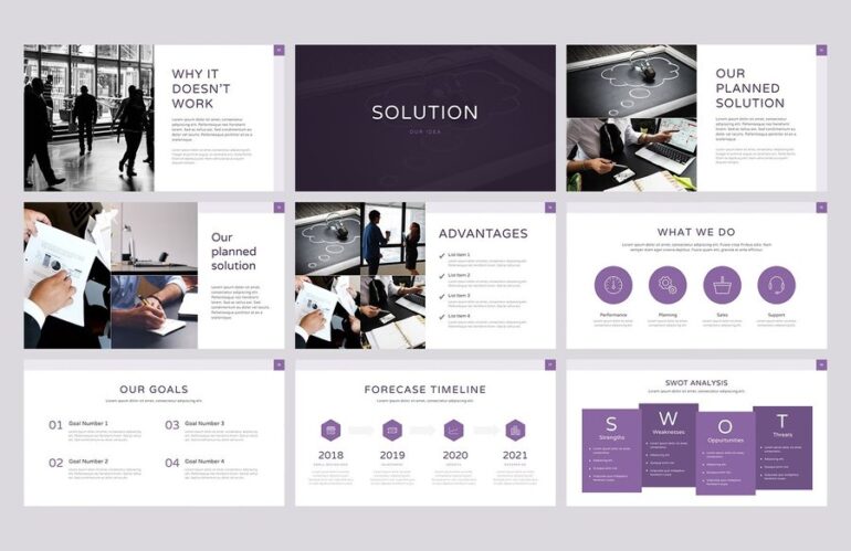
Design matters a lot when it comes to making the best pitch decks. Good design can differentiate between a successful presentation and one that falls flat.
That’s why we’ve put together this list of simple tips and tricks you can use to make sure your next pitch deck is designed for success.
1. Keep it simple

When it comes to pitching deck design, less is almost always more. That’s because you want your audience to focus on your message, not be distracted by busy slides or complex graphics.
So, when putting together your next presentation, keep the overall design clean and simple. Use plenty of white space and stick to a limited color palette. And don’t be afraid to use basic shapes and icons to help get your point across. This will give a completely new dimension to your presentation.
2. Make use of contrast
When using the best pitch deck template, it’s essential to consider using contrast to your advantage. Contrast can help to make your slides more visually exciting and easier to read.
For example, you might use a light background with dark text or vice versa. You can also use contrast to highlight some aspects on your slides, such as using a brighter color for critical points or statistics. You can make your presentation more engaging and memorable by carefully incorporating contrast into your pitch deck design.
3. Use professional-looking templates

A good pitch deck is essential for any startup looking to raise capital. While there are many ways to create a pitch deck, one of the simplest and most effective ways is to use professional-looking templates.
You can use a letterhead example available online, which you can customize to fit your company’s branding. In addition, using templates can help to ensure that your deck is consistent and professional-looking.
While it may take some time to create great pitch decks that look polished and professional, it will be worth it in the long run when you’re trying to convince investors to put their money into your business.
4. Choose the right fonts
When it comes to fonts, there are two things you’ll want to keep in mind. First, make sure to choose a font that’s easy to read. Second, stick to one or two fonts at most so as not to overwhelm your audience.
A good rule of thumb is to use a sans-serif font for your slide headers and a serif font for your body copy. This combination is easy to read and will help ensure that your audience can follow your presentation.
5. Use high-quality images

Images can help break up text-heavy slides, highlight important data points, and add an element of personality to your presentation.
When choosing images for your pitch deck, be sure to use professional-looking photos that are relevant to your business.
For example, if you pitch a new letterhead app, include an image of an attractive letterhead design.
Similarly, if you are pitching a new fitness tracker, include a photo of someone using the tracker in a relevant way (e.g., running with it on their arm).
Taking the time to choose high-quality images will make your pitch deck more effective and more likely to impress potential investors.
6. Keep your slides concise
In addition to keeping your overall presentation design simple, you’ll also want to ensure that each slide is straightforward. It means sticking to one central point per slide.
Doing this will help ensure that your audience can easily understand and remember the key points from your presentation. It will also help prevent your slides from looking cluttered or busy.
7. Use transitions sparingly

A transition is a visual aid that allows the audience to follow the flow of your presentation. Transitions can help post key points or highlight relationships between ideas when used sparingly. However, too many transitions can be distracting and make your presentation disjointed.
When creating a pitch deck for investors, it is essential to balance using transitions to add interest and keep your presentation straightforward.
Too many transitions may give the impression that you are trying to hide something or that you don’t have faith in your material.
On the other hand, failing to use transitions can make your presentation seem overly simplistic. Using transitions judiciously, you can add clarity and interest to your pitch deck without overwhelming your audience.
8. Proofread your slides
Last but not least, make sure to proofread your slides before you present them to your audience. It will help ensure that there are no typos or grammatical errors in your presentation. Also this should help you in better presentations.
Doing this will help you come across as professional and polished. And it will also help ensure that your audience can easily understand and follow along with your presentation.
Conclusion

Pitch decks are a great way to present your ideas to potential investors, partners, or customers. But, to be effective, it’s essential to ensure they’re well-designed.
By following the tips above, you can be sure that your next pitch deck is easy to read and follow and looks professional.
Read this article to help you make beautiful pitch decks that work for your specific needs. Here we present you a lot of templates and designs waiting for you.
