Creating the perfect wedding invitation can seem overwhelming, but it doesn’t have to be. With a few smart choices, anyone can craft a stunning invite that impresses guests from the moment they open it. Whether you’re aiming for a classic look or something modern, a professional finish is always within reach. Here are some design hacks that will elevate your invitations to the next level.
Key Points:
- Prioritize simplicity for maximum impact.
- Choose high-quality paper for a luxe feel.
- Make sure fonts match your theme.
- Add a personal touch with custom elements.
- Use a clear layout to avoid crowding.
- Stick to a cohesive color palette.
- Focus on the envelope as a key part of the invite.
- Proofread every detail multiple times.
Prioritize Simplicity for Maximum Impact

One of the best ways to make your wedding invitations stand out is to keep them simple. A cluttered invitation can overwhelm the recipient and distract from the important details. Instead, focus on one or two key elements. This could be an elegant monogram or a beautiful floral border. A clean design ensures that the invitation is easy to read and looks polished.
Svatba Oznámení provides stylish, personalized svatební oznameni, incorporating the simplicity to perfectly reflect the essence of each couple’s big day.
Choose High-Quality Paper for a Luxe Feel
The quality of paper you use can make or break your invitation. Thin or flimsy paper often looks cheap, no matter how great the design might be. To create a professional look, invest in thicker, premium paper stocks. Textured paper, cotton-based stocks, or even handmade varieties add a touch of luxury that will impress your guests. It might cost a bit more, but the elevated experience is worth it. A good rule of thumb is to pick paper that feels substantial in hand.
Make Sure Fonts Match Your Theme
A bold, modern font suits a contemporary wedding, while a delicate script feels right for something more traditional. Stick to one or two fonts at most, and make sure they complement each other. Avoid using too many different font sizes and styles, as this can make the invitation look chaotic. Consistency is key when trying to create a polished, cohesive look.
Add a Personal Touch with Custom Elements

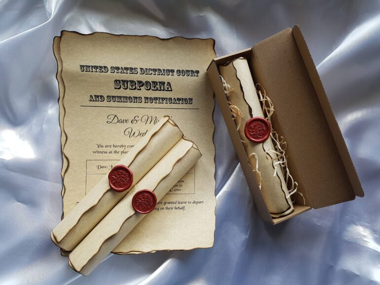
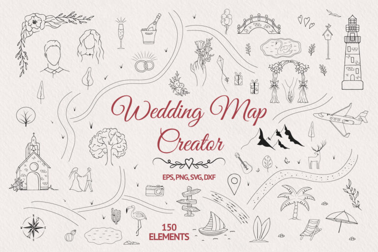
If you want to make your invitations stand out, add personal touches that reflect the couple. Custom illustrations, monograms, or even hand-drawn maps to the venue are great ways to incorporate personality. Small touches like wax seals or ribbons can also make a huge impact. Guests will appreciate the effort and attention to detail. These custom elements show that you care about the big day and about their experience as well.
Use a Clear Layout to Avoid Crowding
An overcrowded invitation is not just hard to read; it can make even the best design look sloppy. Make sure that there is enough space between text blocks, and that important information like the wedding date, venue, and time are easy to locate at a glance. Stick to a basic grid layout where everything has its place. Minimalist designs often do this well, ensuring clarity without sacrificing style.
Stick to a Cohesive Color Palette
Pick a palette that compliments your wedding’s theme, but avoid using too many colors. Two or three tones work best. For example, if you’re having an elegant outdoor wedding, shades of green, cream, and gold may feel appropriate. Make sure the colors are consistent not only on the invitation but also on the envelope and any inserts.
Focus on the Envelope as a Key Part of the Invite

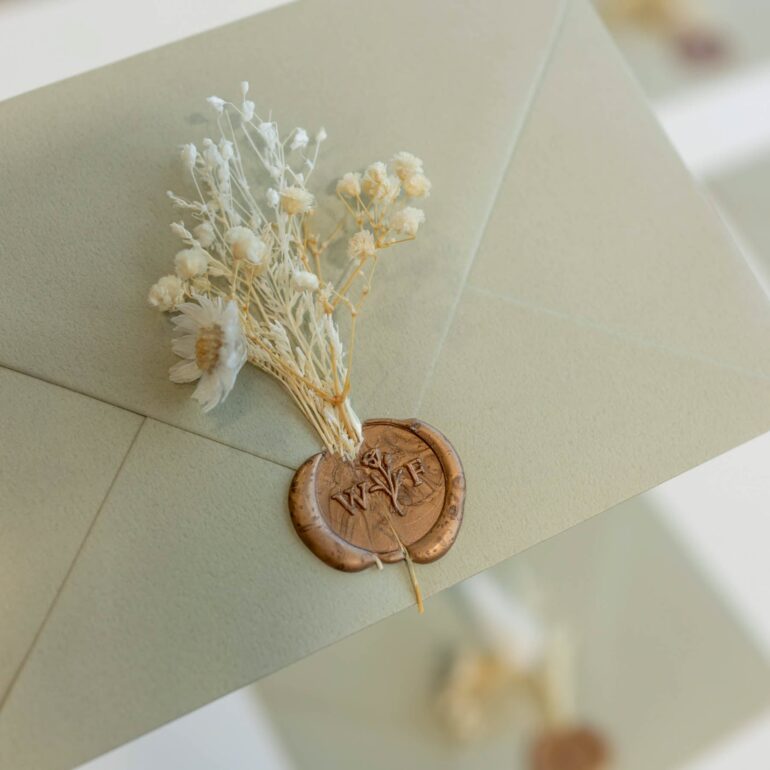
Many people overlook the importance of the envelope, but it’s the first thing guests will see. A beautifully designed envelope sets the tone before the invitation is even opened. Consider matching the color of the envelope to your wedding colors, or choose a classic neutral with a pop of color in the liner. Adding a wax seal, custom stamp, or calligraphy can make the envelope feel even more special.
Final Thoughts
Designing an impressive wedding invitation doesn’t require hiring an expert. By following these hacks, anyone can create something that looks professional and reflects their personality. Prioritize quality, keep the layout simple, and don’t forget those personal touches. Guests will notice the care you put into every detail, and your invitation will leave a lasting impression.
Make sure you proofread everything, choose quality materials, and match your fonts to your overall theme. The goal is to create something that both you and your guests will cherish. A well-designed invitation is more than just a piece of paper—it’s a statement about the special day to come.
