Interestingly, some of the world famous logos today were not drawn by professional artists or designers, but by the owners of companies, assistants, accountants and other people who have nothing to do with art and design.
Below are just a few of the most famous logos and their stories. You can find more logos on the website and see the history of their development with a detailed description of each period.
Adobe is the creek behind the house
The Adobe logo is the letter “A” inscribed in a rectangle. There are a lot of similar solutions with the first letter of the alphabet. Negative and positive spaces work well in the Adobe Systems logo. And in the fact that we see two triangles: a stylized letter “A” and a triangle inside. The lower border of the sign is formally completed by the inscription “Adobe”.
The American software company behind well-known programs such as Photoshop and Illustrator was founded by John Warnock and Chuck Geschke in 1982.
In 1990, a significant event took place – the graphic program Adobe Photoshop appeared. In 1998, Adobe nearly bought out desktop publishing rival Quark Inc.
Adobe was founded by two programmers and named after the small California river Adobe Creek, which flowed behind the house where they worked. At the initial stage of work, they had almost no money, so they did not order a logo from a design bureau, it was drawn by the wife of one of the founders.
Naked mermaid in the Starbucks logo
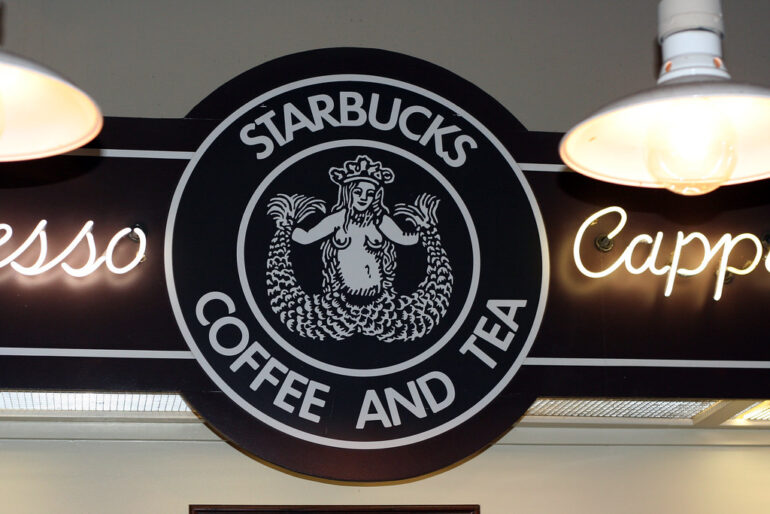
In 1987, the mermaid closed her chest, and a navel was drawn in the right place. We also cropped the logo so as not to worry why she has two tails and what is hidden between them.
In 1971, English teacher Jerry Baldwin, history teacher Zev Siegl, and author Gordon Bowker folded $1,350, borrowed another $5,000, and opened a coffee bean shop in Seattle.
According to other sources, the first store of the company was opened on March 31, 1971. The trio were inspired to trade in high quality coffee beans and equipment after coffee entrepreneur Alfred Peet taught them his method of roasting the beans.
Starbucks was named after Captain Starbuck’s mate in Moby. The stylized image of the siren became the logo. The mermaid on the Starbucks logo is unrecognizable; in 1987, her magnificent breasts were covered with hair, and a navel was drawn in the right place. Later, they made an even larger zoom on the mermaid so that the consumer does not care why she has two tails and what is hidden between them.
Hyundai logo – shake hands with the client
Many people think that the Hyundai logo is the first letter of the name. The letter H symbolizes two people shaking hands (on the one hand – the client, on the other – a representative of the company)
The Hyundai brand is one of the favorite car brands in Russia. One of the top five automotive manufacturers worldwide. The South Korean brand has factories in 8 countries around the world. In Russia, in St. Petersburg, there is also a plant that produces cars of the Hyundai brand. The Hyundai plant in Ulsan, Korea, produces 1.5 million vehicles a year.
The first cars had only a logo. “Hyundai” translates as “modernity”. The sign we are used to appeared in 1991. The stylized image of the letter has a hidden meaning: two people shaking hands. The logo illustrates the special relationship between a company representative and a client.
Why did they bite off the apple in the Apple logo?
The creator of the Apple logo, Rob Yanov, said that the apple on the emblem does not contain allusions, but it is drawn bitten so as not to be confused with a tomato.
According to Steve Jobs, the company got its name from the fruit diet he was on at the time. The apple seemed to him a symbol “funny, spiritual and does not humiliate anyone.”
The creator of the logo, Rob Yanov, said that the apple on the emblem does not contain any allusions, and it is drawn bitten in order not to be confused with a tomato.
The simple black and white sign I put on the cover came with iMac G3s that looked like colored candy. Thanks to the idea, they became style icons and their images appeared at every step: in films, in magazines, in advertising. The original Rob Yanov sign looked out of place, and in 1998 Apple stopped using the multi-colored logo and switched to a monochrome image.
Smiling symbol from LG
The symbol of the LG logo is a stylized face of a smiling person. According to the official description, the composition indicates the desire to maintain “human” relationships.
The main symbol of the logo of the South Korean electronics manufacturer LG is a stylized face of a smiling man. According to the brand’s official description, this composition indicates the company’s desire to maintain “human” relationships with all customers.
Salvador Dali and lollipops Chupa Chups
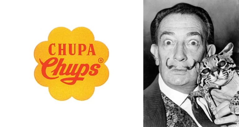
The brand name Chupa-Chups comes from the Spanish verb chupar – “to suck”. In 1969, Dali placed the spelling inside a chamomile. As the artist said, the work on the logo took no more than an hour.
According to legend, Enrique Bernat saw how the mother scolds the child for having his hands stained with melted sweets, and came to the conclusion that at that time the design of sweets should be with a stick. He also came up with the layout of the goods. Previously, sweets were laid out behind the counter and the children could not reach. He insisted on taking the candy out to the front of the cash register so that every child could reach for the sweets.
A sweet product needed a sweet logo. Not many people know that it was Salvador who created the world-famous logo of sweet candies on a stick. As Dali himself said, the work on the logo took no more than an hour – from the development of an idea to its final completion. In 1969, Enrique Bernat turned to the famous artist Salvador Dali, who came up with the idea of placing the name Chupa Chups inside a chamomile flower. Dali advised to place the logo on top so that it is always visible in full.
In 1988, the logo design was updated. So the sign was born, which is now recognizable all over the world.
The expulsion of the nestling from the Nestle logo

Initially, the Nestle logo had 3 chicks. In 1988, during a rebrand, marketers threw one chick out of the nest so that the logo would resonate with more mothers.
German pharmacist Henry Nestlé, the founder of Nestlé, set up production of his legendary farine lactée milk flour in Vevey, Switzerland. The product that Henry developed was a combination of cow’s milk, wheat flour and sugar. Henry Nestle created it to reduce the high mortality rate among those babies who, for one reason or another, could not be breastfed. By this time, the pharmacist began to create his new trademark – a family coat of arms, which depicts a nest with birds. The world famous logo, which served as the prototype of the modern sign, appeared in 1868.
An interesting story is connected with the image of the Nestle logo. Initially, there were 3 chicks in the Nestle logo, but after conducting research, the company’s marketers found out that most European families have two children, not three. In 1988, during one of the rebrandings, marketers decided to throw one chick out of the nest so that the logo would resonate with more mothers.
